
Dark Mode Email Designs have moved from a niche preference to a core expectation for modern email users. As devices and apps increasingly support dark themes, marketers must ensure emails render properly in low-light environments. When done well, dark mode reduces eye strain, improves readability, and enhances the overall visual experience while also helping conserve battery on OLED and AMOLED screens. It also signals that a brand is modern, user-focused, and attentive to subscriber experience in a crowded inbox.
A large portion of users now actively use dark mode across their devices. Without proper optimization, emails can appear broken—such as distorted logos, poor contrast, or unreadable text—which can harm trust and engagement. Success depends on understanding how different email clients handle dark themes, building flexible color systems, optimizing visuals, and ensuring accessibility compliance. Testing across platforms is also essential to maintain consistency and deliver a polished experience.
This guide explores practical strategies for designing effective dark mode emails, including maintaining brand consistency, improving readability, and following accessibility standards. Whether updating existing templates or creating new ones, applying these best practices helps improve engagement and ensures your emails look professional in any viewing environment.
Why Dark Mode Email Designs Are Essential for Engagement
Reducing Eye Strain and Conserving Battery
Dark Mode Email Designs transform the conventional white canvas into a muted backdrop that soothes the eyes in dim or high-contrast settings. Research shows that reducing blue light exposure can alleviate eye fatigue, particularly when reading on mobile devices after sunset. According to a study hosted on PubMed Central, prolonged exposure to bright screens can disrupt circadian rhythms and contribute to sleep disturbances. By offering a darker interface for email consumption, brands demonstrate awareness of subscribers’ well-being and modern usage patterns.
For marketers looking to improve performance alongside design, understanding how engagement metrics work is crucial. Insights from what is a good click rate for email marketing help connect design improvements with measurable outcomes.
Furthermore, dark interfaces significantly extend battery life on devices with OLED and AMOLED displays. These panels power off individual pixels to render black, leading to measurable energy savings in comparison to white backgrounds. In today’s mobile-first world, users expect both visual comfort and efficient performance. Implementing Dark Mode Email Designs signals to recipients that your brand prioritizes a premium, low-impact experience.
Elevating Brand Perception
Leveraging dark themes can reinforce perception of a sophisticated, forward-thinking brand. A well-executed dark mode layout conveys attention to detail—no floating white boxes around transparent logos, no blurred images, and no unreadable text blocks. Inconsistent rendering across dark and light schemes undermines user trust: recipients may fault the brand for poor quality rather than their email client. By proactively designing for both modes, you demonstrate expertise, reliability, and a commitment to accessibility.
Differentiation hinges on subtle nuances. Dark Mode Email Designs offer an opportunity to refresh your visual language while maintaining brand equity. Carefully selected accent colors, refined typography, and clear hierarchy ensure that the subscriber journey remains intuitive, whether viewed under bright daylight or in a dimly lit environment.
A well-optimized dark mode experience strengthens brand credibility and professionalism. Poorly rendered emails with broken images or inconsistent colors can reduce trust instantly.
This is particularly important when crafting high-quality messages, such as those covered in write a marketing email that actually gets results, where presentation directly affects engagement and conversions.
Dark Mode Email Designs ensure that your branding remains visually consistent across all environments, reinforcing recognition and authority.
How Email Platforms Currently Handle Dark Mode

Automatic Inversion Behaviors
Different email clients employ varied approaches to dark mode rendering, which can introduce unexpected visual shifts if left unaddressed. For example, Apple Mail on iOS automatically inverts light backgrounds into near-black tones, while preserving original image assets unless tagged otherwise. Gmail on Android may apply a partial inversion, leaving some elements untouched and leading to mismatched aesthetics. Outlook mobile enforces its own algorithmic adjustments, sometimes inverting colors within images and icons. These auto-inversions can transform carefully chosen color palettes into unreadable or garish versions.
Understanding audience behavior is key here, and resources like what is a good open rate for email marketing can help identify where and how users are interacting with your emails across devices and platforms.
To navigate these inconsistencies, start by auditing your subscriber analytics to identify the most prevalent email clients in your audience. Email service providers often surface client usage data, enabling you to prioritize testing on the platforms that matter most. This targeted approach ensures that your Dark Mode Email Designs hold up where engagement is highest.
Testing Strategies Across Clients
In today’s multi-device world, testing across both software and hardware is nonnegotiable. Professional platforms such as Litmus or Email on Acid simulate dark mode across dozens of client and operating system combinations. These tools highlight image inversion, broken layouts, and color conflicts, helping you pinpoint where custom overrides are necessary.
Manual verification remains critical. Open test emails on actual devices—iOS Mail in dark mode, Gmail mobile, Outlook desktop, and Android’s default client. Capture screenshots, annotate problem areas, and iterate on your code until design elements remain faithful under each scenario. Document each client’s quirks in an internal style guide to streamline future campaigns and maintain consistency in Dark Mode Email Designs.
Developing Dual-Palette Color Schemes and Image Strategies
Crafting Compatible Color Pairings
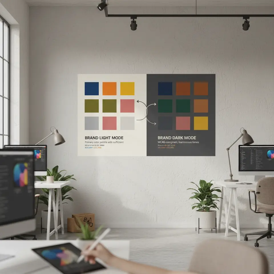
Success in Dark Mode Email Designs hinges on selecting color palettes that perform equally well on bright and dim backgrounds. Pure black (#000000) may feel harsh when paired with stark white text in dark mode; likewise, using pure white (#FFFFFF) backgrounds can overwhelm the eye. Instead, adopt subtle alternatives—dark charcoal (#121212) for backgrounds and off-white (#F5F5F5) for text—to reduce contrast strain while preserving readability.
Implement a dual-palette approach, mapping each brand color to a complementary dark mode variant. For instance, a signature blue (#0055FF) might translate to a gentler tone (#3399FF) in dark mode, ensuring it stands out without overpowering the design. Document these pairings thoroughly so designers and developers can reference a single source of truth. In today’s fast-paced workflows, a clear style guide eliminates guesswork and safeguards the integrity of Dark Mode Email Designs.
Optimizing Images and Icons
Graphics with transparent or white backgrounds often appear as distracting white blocks in dark mode. To prevent this, deliver PNGs with true transparency and provide alternative dark-mode-specific versions through conditional CSS or media queries. Some ESPs permit embedding both light and dark variants within the same email, toggling visibility based on the @media(prefers-color-scheme: dark) query.
Icons, logos, and decorative illustrations deserve special attention. Develop two optimized sets: one tailored for light backgrounds and one for dark canvases. Verify that strokes and fills maintain a minimum contrast ratio of 4.5:1, in compliance with WCAG 2.1 standards. Rigorous testing ensures that inverted or auto-adjusted assets never dilute your brand’s visual identity.
Ensuring Accessibility and Structuring HTML/CSS for Dark Mode
Accessible Typography Guidelines
Accessibility remains a cornerstone of inclusive Dark Mode Email Designs. All text elements should meet or exceed a contrast ratio of 4.5:1 for body copy and 3:1 for larger headings, aligning with WCAG checkpoints. Avoid pale gray text on black backgrounds, as it can cause optical ‘vibrations’ and hinder legibility—especially for users with low vision or dyslexia.
Choose system fonts like Arial or Helvetica to boost rendering consistency and reduce load times. Set a base font size of 14–16px for body text, accompanied by line spacing between 1.4 and 1.6. Use clear hierarchy—headings, subheadings, bulleted lists, and highlighted callouts—to break up long passages and guide the reader’s eye. In today’s fast-scanning environment, a well-structured layout enhances comprehension and drives engagement.
Implementing Robust HTML and CSS Techniques
While inline styles remain the most reliable across diverse email clients, leveraging dark mode media queries can elevate Dark Mode Email Designs on platforms that support them. A typical snippet might include:
@media (prefers-color-scheme: dark) {.dark-mode-text { color: #F5F5F5 !important; } .dark-mode-bg { background-color: #121212 !important; }}Because not all clients honor @media queries, define primary styling inline for light mode, then layer on overrides for dark mode where feasible. Adopt a hybrid coding strategy: inline critical styles, include a concise CSS block in the head, and fall back to default color-safe values when queries go unrecognized. This multi-tiered approach maintains design coherence and ensures Dark Mode Email Designs remain functional for every recipient.
Optimizing Performance, Automation, and Impact Measurement

Performance and Load Time Considerations
Email size and complexity directly affect deliverability and engagement. Compress all images—JPEGs for photographs, optimized PNGs for graphics—while preserving transparent backgrounds where needed. Consolidate CSS into compact blocks, eliminating redundant declarations. Rely on inline styles for mission-critical rules, and avoid external style sheets that may be stripped by certain clients.
Monitor your email payload using your ESP’s analytics dashboard. Aim to keep the total message size under 100KB to prevent clipping or truncation. In the context of Dark Mode Email Designs, an unexpected clip can sever media queries or hide essential dark-mode assets, leading to broken visuals and a poor subscriber experience.
Automating Dark Mode Workflows and Tracking Impact
As Dark Mode Email Designs become mainstream, integrating automation into your production workflow saves time and reduces errors. Several design-to-code tools and ESPs now offer toggles that generate both light and dark versions simultaneously. Others support custom color variables that compile into dual-mode CSS at export. Evaluate these solutions to streamline template creation and ensure consistent implementation across campaigns.
Measuring the effectiveness of your dark mode initiatives requires a data-driven approach. Where possible, segment open and click-through rates by color-scheme preference. If your ESP lacks direct reporting, deploy custom UTM parameters or survey a test segment to infer user settings. Complement quantitative data with qualitative feedback—invite subscribers to share their experiences regarding readability and aesthetics.
Continuous iteration based on real-world performance ensures your Dark Mode Email Designs remain aligned with audience expectations. By analyzing behavioral metrics and incorporating user insights, you’ll refine your templates, enhance engagement, and maintain a competitive edge in today’s inbox-centric environment.
FAQ
What is Dark Mode Email Design and why does it matter?
Dark Mode Email Design involves creating email templates that adapt to a dark interface, offering reduced eye strain, battery savings, and a modern aesthetic. It matters because more than half of users now prefer dark mode, and supporting it signals that your brand values both usability and visual comfort.
How can I test my emails for dark mode compatibility?
Use professional testing platforms like Litmus or Email on Acid to simulate dark mode across various clients. Additionally, conduct manual checks on real devices—iOS Mail, Gmail mobile, Outlook desktop—to catch client-specific quirks and document solutions in your style guide.
What are the best practices for optimizing images in Dark Mode Email Designs?
Provide PNGs with true transparency, create separate dark-mode image variants, and leverage the @media(prefers-color-scheme: dark) query to swap assets. Ensure all visual elements meet a minimum contrast ratio of 4.5:1 to maintain readability and brand consistency.
How can I automate my dark mode email workflows?
Evaluate design-to-code tools and ESPs that support dual-mode generation through toggles or custom color variables. Automating the creation of light and dark templates reduces errors, speeds up production, and guarantees consistent implementation across campaigns.
Conclusion
Dark Mode Email Designs are no longer a luxury—they’re a critical component of modern email marketing strategies. By embracing dual-palette color systems, optimizing images, enforcing WCAG-driven accessibility, and adopting hybrid HTML/CSS techniques, brands can deliver consistent, eye-catching messages across all platforms. Rigorous testing, combined with performance optimization and workflow automation, further ensures that your campaigns render flawlessly under any viewing conditions.
In today’s digital landscape, subscribers expect brands to anticipate their needs and provide a seamless experience. Developing Dark Mode Email Designs signals that you value user comfort, brand integrity, and technical excellence. Start by auditing your current templates, integrate the best practices outlined here, and continually measure impact to drive ongoing improvements. Your audience—and your bottom line—will benefit from this forward-thinking approach.

I'm Email Campaign Manager who helps businesses design, execute, and optimize effective email marketing campaigns. With expertise in audience segmentation, campaign automation, and performance tracking, ensures emails reach the right audience and deliver measurable results.


No Comments